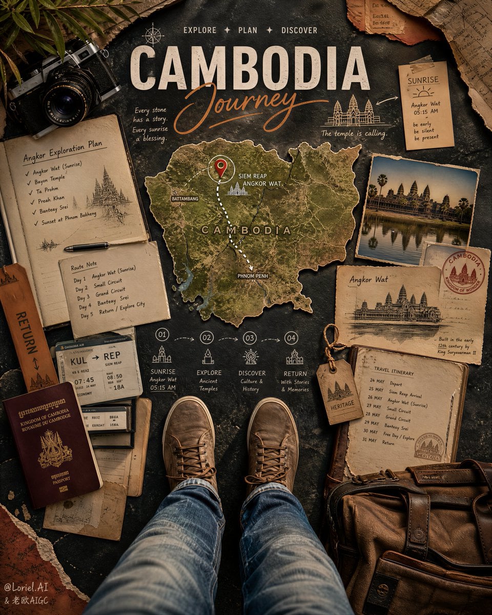
Промпт
Create an ultra-premium top-down travel planning poster for Taiwan, merging extreme tactile realism with a stronger cinematic journey narrative. Fully preserve the editorial logic of a first-person overhead travel board: the viewer stands inside the composition with shoes visible at the bottom center, surrounded by real travel-planning objects, route notes, destination mapping, time scheduling elements, and elegant hand-drawn guide marks. The final artwork must feel like a world-class Taiwan travel campaign with deeper story tension and richer destination identity: hyper-realistic, immersive, handcrafted, clean, cinematic, and highly art-directed.
Core composition:
Use a strict overhead flat-lay point of view. The viewer looks down at their own legs and shoes standing at the bottom center of a carefully designed travel-planning scene. The base surface should be a dark weathered stone or charcoal pavement-like texture with rich tactile detail. Around the viewer, arrange premium travel objects in a balanced editorial layout: a Taiwan map cutout, route drawings, itinerary notes, time markers, camera gear, travel documents, a shoulder bag, postcard fragments, transport references, and destination-specific inserts. The whole composition must feel like a physical journey board assembled by a sophisticated traveler before departure.
Destination reconstruction:
Everything must clearly communicate Taiwan with stronger story emphasis on a poetic route such as Taipei, Jiufen, Alishan, Tainan, and a final coastal or city return. Use a map silhouette of Taiwan with a highlighted route connecting key stops. Add subtle destination references through tasteful printed inserts, railway schedule notes, mountain sunrise planning, tea-house stop cues, lantern-street sketch details, temple silhouette cards, and night-market planning fragments. The image should feel like a real Taiwan journey plan centered around old streets, rail travel, tea culture, mountain atmosphere, urban discovery, and layered local texture.
Travel story objects:
Arrange real physical planning items with strong tactile realism: a Taiwan map cutout with one elegant marked route and several refined destination pins, an itinerary sheet, a month or date planning card, boarding-pass style papers, handwritten route notes, a premium travel camera, a worn leather or canvas bag, ticket slips, postcard fragments, a small Jiufen lantern street sketch card, a tea-house stop note, an Alishan sunrise reminder, and one rail timetable fragment. Every object must feel intentional, realistic, and editorially placed, never random.
Hand-drawn annotation system:
Integrate refined hand-drawn travel annotations across the layout: dotted route lines, arrows, sketch circles, directional marks, playful guide icons, small symbols, and handwritten English note fragments. The annotations must feel spontaneous but beautifully art-directed, like a premium travel journal turned into an official campaign poster. Use text logic like:
Main title: TAIWAN Journey
Supporting English words:
EXPLORE
WANDER
TASTE
SUNRISE
RETURN
You may add subtle handwritten cues such as rail stop notes, tea break marks, lantern alley highlight, mountain dawn timing, and market route reminders. All typography must feel artistic, light, and premium, never crude, never bulky.
Material realism:
Push the realism to the highest level. Paper must show crisp fibers, folded edges, tape marks, soft warping, micro tears, and subtle print texture. The map should look like a real cutout with visible thickness, shadow lift, and surface wear. The bag must show leather or canvas grain, stitching, softened corners, and natural use marks. The camera must feel highly tactile with metal reflections, lens glass depth, tiny scratches, and premium mechanical detail. Denim or travel pants must show natural folds and believable weight. Shoes must show subtle wear, laces, rubber edges, and realistic lighting. Add fine dust, tiny paper crumbs, and micro particles with restraint to heighten realism.
Border and collage logic:
Frame the composition with torn paper edges, layered travel ephemera, warm orange and muted red paper accents, fragments of transit maps, tea-stained paper pieces, and editorial collage details. These border elements must feel handcrafted and premium, helping the whole poster read as a designed travel artifact. Keep the collage controlled, elegant, and clean, never messy.
Lighting:
Use extremely delicate, soft, high-end cinematic lighting with warm directional sunlight falling from the upper area of the frame. Let the light reveal paper fibers, leather grain, stone texture, printed map surfaces, metal camera reflections, and denim folds with beautiful highlight rolloff. Shadows must remain soft and refined, adding depth without visual heaviness. The scene should feel warm, exploratory, and luxurious.
Color direction:
Use a disciplined premium palette: burnt orange, lantern amber, warm cream, charcoal black, weathered stone gray, leather brown, aged paper beige, faded denim blue, moss green, muted rail red, tea-brown, and restrained night-market glow accents used only as tiny details. The overall feeling must be warm, cultured, adventurous, and globally stylish.
Narrative mood:
The image must instantly communicate the romance of planning a Taiwan journey centered around trains, mountain dawn, tea houses, old streets, lantern-lit alleys, temples, and night-market discovery. It should feel like the moment before departure, where physical planning objects, personal presence, and destination mythology all converge. Keep the mood tactile, intelligent, adventurous, aspirational, and slightly nostalgic.
Rendering style:
ultra-premium top-down travel poster, Taiwan destination planning collage, first-person traveler perspective, stronger route-story narrative, hyper-real physical objects, artistic hand-drawn annotations, torn paper editorial border, elegant English title layout, soft cinematic light, extreme material realism, 8k, world-class campaign quality
Negative prompt:
cheap scrapbook look, cluttered layout, cartoon icons, low-detail objects, unreadable messy handwriting, Cambodia references, generic tropical cliches, flat lighting, plastic materials, bad typography, oversaturated colors, random props, weak Taiwan identity, digital UI interface, low-resolution textures