Архитектура
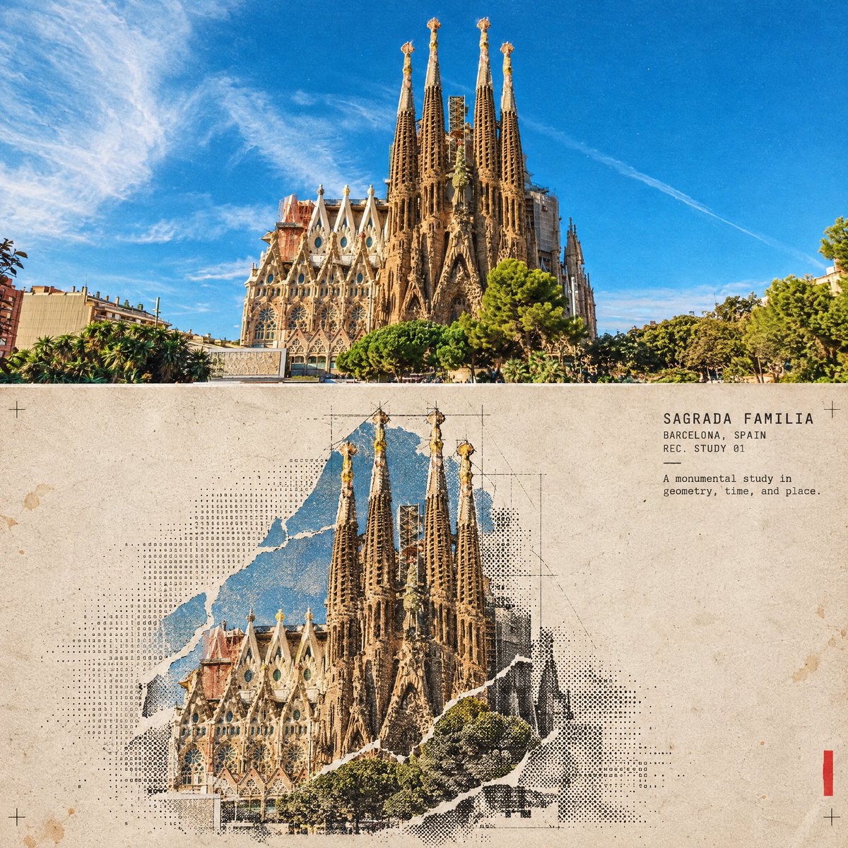
Промпт для создания кинопостера в стиле архитектурного коллажа
Опубликовано 17 сентября 2026
Промпт
Turn this structure photo into a single high-end halftone architectural travel-collage poster. Output one poster per uploaded photo — never merge multiple structures or photos into one frame.
FORMAT
3:4 vertical canvas. Split into two roughly equal zones — real architectural photo on top, printed reconstruction below — divided by one clean, sharp horizontal line.
Do not stretch, warp, tilt, or unnaturally reposition the structure to force the proportions.
TOP HALF — THE REAL SHOT
Preserve the original structure faithfully: same architecture, proportions, perspective, distinctive details, surrounding elements, natural light and shadow, and original color mood.
Keep recognizable features such as:
* façade
* windows and arches
* towers or domes
* doors and structural details
* roofline
* surrounding landscape or street elements
Add only a subtle high-end color grade and the faintest film grain. Do not redesign or reinterpret the architecture.
BOTTOM HALF — THE PRINTED RECONSTRUCTION
Rebuild the same structure as an experimental printed architectural collage using:
torn photographic fragments + fixed-width ASCII character fields + photocopy halftone dots + architectural linework.
The structure must remain immediately recognizable.
* Torn-edge photographic fragments preserve the most important architectural details.
* Brick, stone, glass, metal, shadows, windows, and surrounding textures gradually dissolve outward into ASCII characters, black halftone dots, fragmented print grain, and fine architectural drafting lines.
* Use thin technical construction lines to subtly trace the structure’s geometry.
* Let selected areas break apart into paper fibers and halftone fragments, creating the feeling that the building is emerging from an archival print.
* Keep the main silhouette strong and readable.
* Texture: rough white paper-fiber edges, subtle photocopy imperfections, slight print misregistration, faded ink, old-paper stains, a few restrained crop marks, and one small red calibration bar.
* Color: warm gray old-paper background + black ink + the structure’s original muted colors + a single restrained red accent.
* Never fully desaturate the structure.
The structure should occupy roughly 60–88% of the frame width, scaled according to what reads best for the architecture.
Leave 22–38% of the paper visibly untouched and empty, creating generous negative space so the poster feels like an archival architectural specimen rather than a packed digital screen.
TYPOGRAPHY
Add one clean, readable fixed-width architectural title based on the structure:
[Structure Name]
Below it include:
[City, Country]
REC. STUDY 01
Add one short observational caption related to the architecture, such as:
“A monumental study in geometry, time, and place.”
Typography should feel like an old architectural archive mixed with an underground experimental design journal.
A few loose ASCII glyphs may trace the outer silhouette or architectural edges as texture only — never use ASCII to invent windows, doors, structural details, or technical specifications.
MOOD
Early digital systems × analog photocopy × architectural archive × underground zine × modern travel editorial.
The structure should feel like it is surfacing from an old printed document — half photograph, half architectural drawing, half experimental print.
Sophisticated, minimal, tactile, intellectual, slightly mysterious, and highly collectible.
AVOID
Solid black terminal backgrounds, dense walls of code, cyberpunk neon, excessive ASCII, distorted architecture, impossible geometry, invented architectural details, fake technical specifications, random symbols with no meaning, garbled text, excessive colors, brand logos, QR codes, watermarks, author credits, or tourist-poster clichés.
Priority: Preserve the structure’s identity and architectural accuracy first. The experimental halftone/ASCII treatment should enhance the architecture, not hide it.