Дизайн
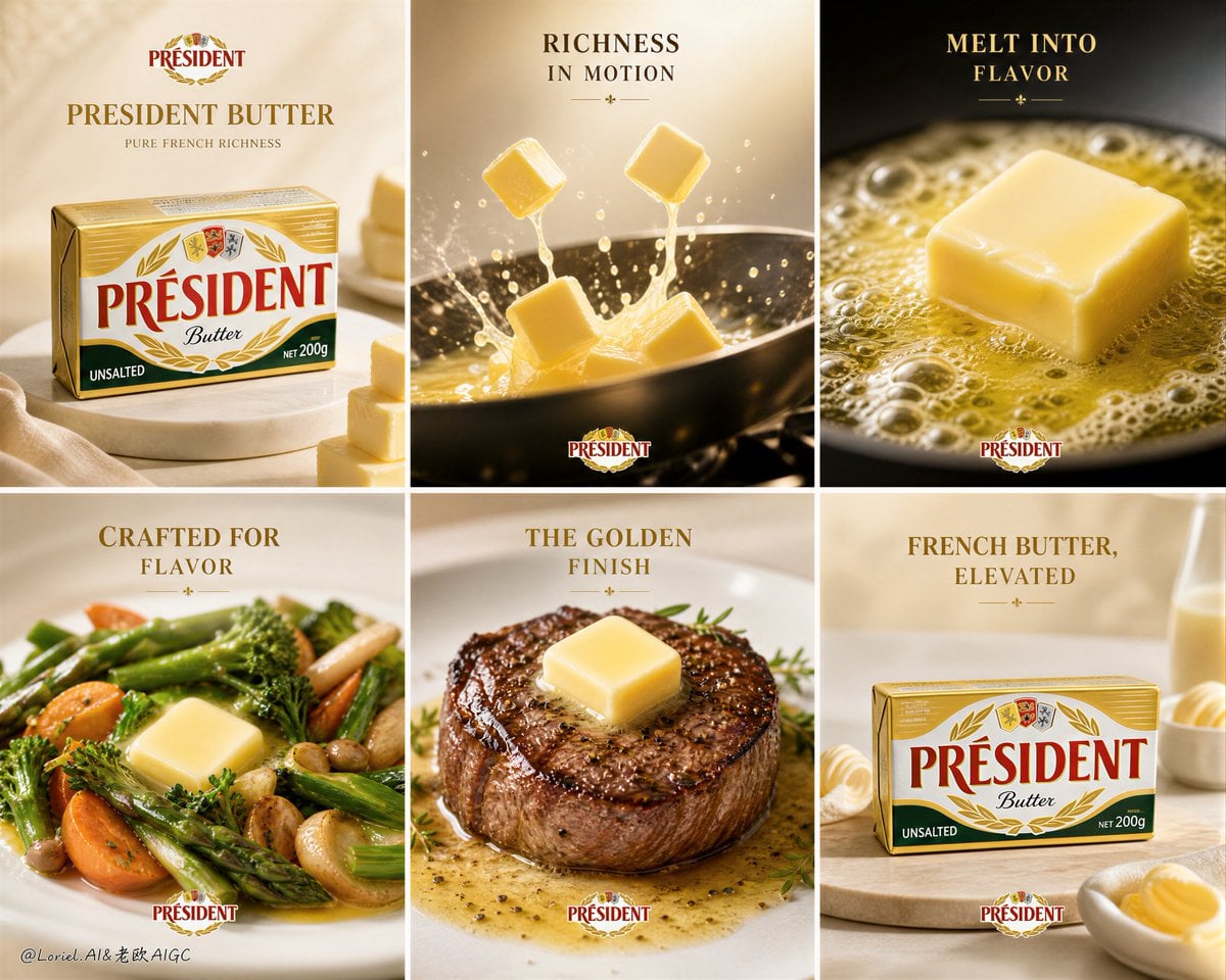
Промпт для создания кинопостера: премиальная реклама масла Président
Опубликовано 29 июля 2026
Промпт
Create an ultra-premium 2x3 six-panel campaign poster for Président Butter, designed as a world-class French butter advertising system with absolute brand unity. The final artwork must preserve a strict six-tile promotional layout, where each panel feels like a premium mini-ad while belonging to one elegant butter campaign. The board must feature the real Président Butter pack design as the hero brand product, combined with multiple ultra-realistic food applications and butter close-ups, using clean refined backgrounds, minimal English typography, strong product hierarchy, and luxurious commercial lighting. The result must feel rich, appetizing, sophisticated, and unmistakably premium, while reducing ordinary kitchen heat and casual home-cooking atmosphere.
Creative direction:
Combine Milk Cloud Orbit and Cream Halo Transit, and reduce the kitchen heat feeling. Keep the exact six-panel campaign skeleton, but purify the most luxurious butter details and simplify the environmental noise. The final image must feel more like a French dairy brand annual campaign and less like a lively kitchen snapshot. Make the butter more iconic, the pack-product relationship tighter, the lighting softer and more editorial, and the whole tone calmer, cleaner, and more premium.
Core composition:
Use a strict 2x3 grid with six equal vertical or near-square panels. Each tile must have a clear campaign structure:
- one hero butter-related product scene
- minimal premium English headline or short phrase
- visible Président branding and pack/logo where appropriate
- clean commercial spacing
- strong product-first hierarchy
The full six-panel board must feel unified, elegant, and immediately readable.
Brand direction:
This is a Président Butter campaign. Keep the brand unmistakably French, premium, creamy, rich, and elegant. Use English-only visible brand headline language such as:
“PRESIDENT BUTTER”
“PURE FRENCH RICHNESS”
“CRAFTED FOR FLAVOR”
Typography must feel refined, editorial, and premium, never cheap or supermarket-generic.
Six-panel content system:
Panel 1: hero pack-shot panel featuring the Président Butter package on a clean premium surface, supported by minimal brand typography and a subtle butter-cube visual cue.
Panel 2: refined action panel showing butter cubes entering a pan, but with a more controlled and elegant motion language, less aggressive kitchen splash, more premium golden softness.
Panel 3: extreme close-up of one butter cube melting in a pan, showing rich foaming butter, bubbling golden fat, and luxurious texture, with a cleaner and calmer background.
Panel 4: premium food-application panel where vegetables are coated with butter gloss, but presented in a more editorial and less kitchen-busy way.
Panel 5: plated steak or grilled meat hero with a melting butter pat on top, emphasizing richness and premium dining use, styled more like a restaurant campaign than a cooking scene.
Panel 6: another pack-centered campaign tile, refined and clean, acting as a closing brand reinforcement panel with elegant typography and subtle food association.
Butter realism:
This is critical. Render the butter with extreme realism: creamy density, pale golden tone, smooth cut edges, soft melting corners, rich gloss when heated, foamy butter bubbles, translucent golden fat, and believable heat-softened surfaces. The butter must feel luxurious, fresh, rich, and unmistakably high quality.
Milk Cloud Orbit butter-light logic:
Purify the most convincing butter zones: cut-surface reflections, melting edge highlights, creamy specular bands, and the golden foam shimmer in heated butter. The butter must feel brighter in the right places, richer, smoother, and more jewel-like without becoming greasy.
Cream Halo Transit hierarchy logic:
Keep the same six-panel structure, but reduce text quantity and tighten the proportion relationship between packaging and food. The pack and butter must feel more central, more deliberate, and more premium. Supporting food must amplify the butter’s value, never distract from it.
Reduced kitchen-heat logic:
This is critical. Remove the feeling of a busy hot kitchen. Reduce steam clutter, reduce messy splash energy, reduce noisy cooking-environment detail, and minimize casual countertop realism. Replace it with a more controlled editorial atmosphere: softer backgrounds, cleaner surfaces, calmer pan edges, more refined depth of field, and a premium studio-food campaign tone. The warmth should remain in the butter, not in a chaotic kitchen setting.
Food realism:
Render all companion food elements with extreme realism and appetizing detail: seared steak crust, vegetable moisture, sauté gloss, plated sauce traces, browned edges, and elegant finishing textures. The dishes must support the butter, never compete with it.
Product dominance:
The Président Butter branding and pack must remain a major hero across the system. The viewer must instantly understand that the campaign is about butter as both premium ingredient and premium packaged product. Food applications amplify the product, not replace it.
Typography logic:
Use elegant English headlines and short premium taglines only. Suggested phrase tone:
“MELT INTO FLAVOR”
“RICHNESS IN MOTION”
“THE GOLDEN FINISH”
“FRENCH BUTTER, ELEVATED”
Keep text minimal, clear, and beautifully integrated. Do not overcrowd the tiles.
Color system:
Use a sophisticated premium palette built from:
creamy ivory, butter gold, pale champagne yellow, warm neutral beige, soft bronze, and restrained herb-green or pan-black accents.
Reduce loud kitchen-orange heat. The system must feel calmer, more French, and more luxurious.
Background logic:
Use clean refined backgrounds with soft editorial depth. Some tiles may lean into warm neutral studio realism, others into minimal food-styling surfaces, but all must feel premium and uncluttered. Avoid messy kitchen storytelling.
Lighting:
Use extremely delicate high-end commercial food lighting. Let the butter glow with creamy highlights, the melted fat shine with golden richness, and the pack shot feel polished and premium. The light must feel soft, controlled, elegant, and luxurious rather than hot and busy.
Surface and finish:
Keep the entire board clean, polished, and collector-grade. The final composition should feel like a premium international dairy-brand annual campaign with strong commercial clarity and beautiful tactile realism.
Mood:
premium, creamy, rich, appetizing, elegant, French, calm, polished, product-dominant, luxurious, commercial, high-end
Rendering style:
ultra-realistic Président Butter campaign poster, 2x3 six-panel premium brand system, butter pack shots and refined food applications, cleaner butter close-ups, reduced kitchen heat feeling, minimal English typography, soft luxury lighting, elegant commercial design, world-class image quality, 8k
Negative prompt:
cheap supermarket flyer, cluttered layout, weak product presence, fake butter texture, plastic-looking melt, greasy splash chaos, strong kitchen mess, loud steam clutter, muddy pan lighting, low-detail food, too much text, cartoon rendering, generic packaging, noisy background, low resolution