Дизайн
Промпт для создания кинопостера: кампания Aurelle с часами и бижутерией
Опубликовано 20 августа 2026
Промпт
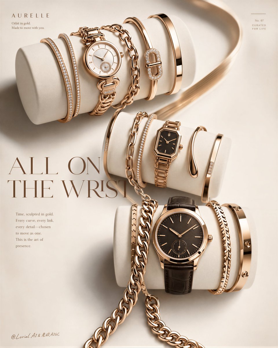
Create an ultra-premium editorial jewelry and watch campaign poster for a fictional luxury accessories house called AURELLE, merging stronger Orbit flow with more refined Transit luxury. Preserve the original structural logic exactly: three large matte ivory cylindrical display forms arranged diagonally across the composition from upper-left to lower-right, each wrapped with a curated stack of luxury wrist accessories. Each cylinder must feature one hero watch supported by layered bracelets, with the full image reading like a sophisticated “all-on-the-wrist” styling manifesto for a top-tier international fashion brand.
Strengthen the Orbit energy by making the three cylinders feel more clearly linked in one flowing diagonal rhythm: the bracelet stacks, chain curves, watch faces, and polished metal arcs should visually pull the eye from the upper-left set through the middle set and down into the lower-right set. The composition should feel like one continuous golden motion path rather than three separate product groupings. At the same time, push the Transit direction strongly by refining spacing, reducing text noise, softening excessive sparkle, and making the whole page feel more international, more editorial, and more expensive.
Upper cylinder:
Feature one elegant round women’s watch in warm rose-gold with a refined original dial layout, paired with slim pavé bangles, polished smooth cuffs, graceful chain-link bracelets, and one distinctive clasp or signature jewelry accent. Keep the stack rich but controlled, with clean overlap and premium spacing.
Middle cylinder:
Feature one smaller rectangular or octagonal dress watch with a dark dial and warm metallic case, surrounded by mixed bracelet textures such as chain links, delicate pavé strands, and polished open bangles. This central set should act as the visual bridge between upper and lower compositions.
Lower cylinder:
Feature one larger round men’s or unisex watch with a dark leather strap and warm gold case, paired with slightly bolder sculptural bracelets and one stronger chain element that spills or drapes more assertively, helping to complete the diagonal flow. The lower grouping should feel grounded, rich, and slightly more powerful in weight.
Material realism must be exceptional: rose-gold and champagne-gold metal with precise polished reflections, restrained brushed highlights where needed, crisp watch case chamfers, believable crowns, original and elegant dial details, premium leather grain, fine pavé sparkle, and realistic jewelry weight and contact. Every object must feel collectible and couture-level, never generic catalog jewelry.
Lighting should be soft, directional, and luxury-editorial, with refined overhead-front illumination and subtle side shaping. The metal reflections should be rich but controlled, never flashy. The matte white cylinders should feel sculptural and smooth, serving as quiet stages for the jewelry. Shadow pockets between bracelet layers should be delicate and dimensional, helping form separation and premium depth.
Typography and layout:
Add one original small heading near the upper-left, one large elegant serif fashion headline across the middle-left to center area, and one short refined editorial copy block beneath. If desired, include one tiny label-like accent near the upper-right and one tiny byline-like text near the lower-left. All wording must be original, sparse, and secondary. Push the Transit feel by keeping typography lighter, cleaner, and more fashion-editorial than promotional.
Style:
International luxury jewelry and watch campaign, high-fashion magazine cover ad, premium accessories styling editorial, Cannes-level commercial elegance. The final image must feel globally premium, softly opulent, and immediately aspirational.
Color system:
Ivory white display forms, warm rose gold, champagne gold, subtle dark watch dials, dark espresso or black leather strap, soft gray shadows, and restrained diamond-like white sparkle. Keep the palette elegant, minimal, and highly controlled.
Negative prompt:
no copied brand names, no copied watch dial branding, no existing luxury logos, no cluttered props, no extra background objects, no distorted bracelet geometry, no warped watches, no muddy reflections, no black blotches, no cheap catalog look, no watermark, no noisy layout.